Modern CSS Layouts: Flexbox vs. Grid
Modern CSS Layouts: Flexbox vs. Grid
Introduction to CSS Layouts
In the early days of web development, creating complex and responsive layouts was a significant challenge. Developers often relied on tables, floats, and inline-block elements, which were primarily designed for document structuring rather than intricate page layouts. These methods were often hacky, difficult to maintain, and struggled to adapt to the ever-increasing variety of screen sizes and devices. The advent of responsive web design further highlighted the limitations of these traditional approaches, as developers sought more robust and flexible ways to arrange content dynamically.
The landscape of CSS layouts has dramatically evolved with the introduction of Flexbox (Flexible Box Layout) and Grid (CSS Grid Layout). These two powerful modules provide native, efficient, and semantic ways to build sophisticated layouts directly within the browser. They represent a paradigm shift, moving from one-dimensional layout techniques (like floats) to truly two-dimensional and flexible container models. Understanding when and how to use Flexbox and Grid, both individually and in combination, is crucial for any modern web developer aiming to create responsive, maintainable, and visually appealing user interfaces.
While both Flexbox and Grid are designed to solve layout problems, they approach them from different perspectives and excel in different scenarios. Flexbox is primarily a one-dimensional layout system, ideal for distributing and aligning items within a single row or column. Grid, on the other hand, is a two-dimensional layout system, perfect for arranging items in both rows and columns simultaneously, creating complex page structures. This article will delve into the core concepts of both Flexbox and Grid, explore their unique strengths, provide practical examples, and discuss how they can be effectively combined to build highly responsive and adaptable web designs.
Understanding Flexbox: The One-Dimensional Layout System
Flexbox is a powerful one-dimensional layout module designed for distributing space among items along a single axis (either horizontal or vertical) and aligning them. It provides a more efficient way to lay out, align, and distribute space among items in a container, even when their size is unknown or dynamic. Flexbox is perfect for components within a page, such as navigation bars, form elements, or card layouts.
Flex Container and Flex Items
To use Flexbox, you first define a flex container by setting the display property of an element to flex or inline-flex. All direct children of this flex container automatically become flex items. The flex container is responsible for controlling the layout of its flex items.
.container {
  display: flex; /* Makes the container a flex container */
}
Main Axis and Cross Axis
Flexbox operates along two axes:
- Main Axis: This is the primary axis along which flex items are laid out. Its direction is determined by the
flex-directionproperty. - Cross Axis: This is the axis perpendicular to the main axis. Its direction depends on the main axis.
By default, flex-direction is row, meaning the main axis runs horizontally from left to right, and the cross axis runs vertically from top to bottom. If flex-direction is set to column, the main axis runs vertically, and the cross axis runs horizontally.
Key Flexbox Properties
Flexbox provides a rich set of properties that can be applied to both the flex container and the flex items to control their behavior.
Container Properties:
flex-direction: Defines the direction of the main axis (e.g.,row,row-reverse,column,column-reverse).justify-content: Aligns flex items along the main axis (e.g.,flex-start,flex-end,center,space-between,space-around,space-evenly).align-items: Aligns flex items along the cross axis (e.g.,flex-start,flex-end,center,stretch,baseline).flex-wrap: Controls whether flex items wrap onto multiple lines (e.g.,nowrap,wrap,wrap-reverse).align-content: Aligns flex lines when there is extra space in the cross axis andflex-wrapis set towrap(e.g.,flex-start,flex-end,center,space-between,space-around,stretch).
Item Properties:
flex-grow: Specifies how much a flex item will grow relative to the rest of the flex items in the container when there is extra space.flex-shrink: Specifies how much a flex item will shrink relative to the rest of the flex items in the container when there is not enough space.flex-basis: Defines the initial size of a flex item before any growing or shrinking occurs.flex: A shorthand forflex-grow,flex-shrink, andflex-basis.order: Controls the order in which flex items appear in the flex container.align-self: Overrides thealign-itemsproperty for individual flex items.
Flexbox Example: A Responsive Navigation Bar
Let’s create a simple responsive navigation bar using Flexbox. This is a classic use case where Flexbox shines, as it allows for easy distribution and alignment of navigation links.
HTML:
<nav class="navbar">
  <a href="#" class="logo">MyLogo</a>
  <ul class="nav-links">
    <li><a href="#">Home</a></li>
    <li><a href="#">About</a></li>
    <li><a href="#">Services</a></li>
    <li><a href="#">Contact</a></li>
  </ul>
</nav>
CSS:
.navbar {
  display: flex;
  justify-content: space-between; /* Distribute space between logo and links */
  align-items: center; /* Vertically align items */
  background-color: #333;
  padding: 10px 20px;
  color: white;
}

.logo {
  font-size: 24px;
  font-weight: bold;
  color: white;
  text-decoration: none;
}

.nav-links {
  list-style: none;
  margin: 0;
  padding: 0;
  display: flex; /* Make nav links a flex container */
}

.nav-links li {
  margin-left: 20px;
}

.nav-links a {
  color: white;
  text-decoration: none;
  padding: 5px 10px;
  transition: background-color 0.3s ease;
}

.nav-links a:hover {
  background-color: #555;
  border-radius: 4px;
}

/* Basic responsiveness for smaller screens */
@media (max-width: 768px) {
  .navbar {
    flex-direction: column; /* Stack items vertically */
    align-items: flex-start; /* Align items to the start */
  }

  .nav-links {
    flex-direction: column; /* Stack links vertically */
    width: 100%;
    margin-top: 10px;
  }

  .nav-links li {
    margin: 5px 0;
    width: 100%;
  }

  .nav-links a {
    display: block;
    text-align: center;
  }
}
In this example, the .navbar is a flex container that uses justify-content: space-between to push the logo to one end and the navigation links to the other. align-items: center ensures vertical alignment. The .nav-links list is also a flex container, arranging its li items horizontally. The media query demonstrates how Flexbox can easily adapt to smaller screens by changing flex-direction to column, stacking elements vertically.
Understanding CSS Grid: The Two-Dimensional Layout System
CSS Grid Layout is a two-dimensional layout system that allows you to arrange content into rows and columns. It gives you precise control over the placement and sizing of items within a grid structure, making it ideal for designing entire page layouts or complex sections with overlapping elements. Unlike Flexbox, which works primarily with content flow along a single axis, Grid excels at defining a grid and then placing items into specific cells or areas within that grid.
Grid Container and Grid Items
To use CSS Grid, you define a grid container by setting the display property of an element to grid or inline-grid. All direct children of this grid container automatically become grid items. The grid container is responsible for defining the grid structure and placing its items.
.container {
  display: grid; /* Makes the container a grid container */
}
Defining Grid Tracks: Rows and Columns
The core of CSS Grid is defining the grid structure using grid-template-rows and grid-template-columns. These properties allow you to specify the number, size, and names of your grid lines and tracks (rows and columns).
grid-template-columns: Defines the number and width of columns.grid-template-rows: Defines the number and height of rows.
You can use various units, including px, %, em, rem, and the special fr unit (fractional unit), which represents a fraction of the available space.
.container {
  display: grid;
  grid-template-columns: 1fr 2fr 1fr; /* Three columns: 1 part, 2 parts, 1 part */
  grid-template-rows: auto 100px 1fr; /* Auto height, 100px height, 1 fractional part */
}
Placing Grid Items
Once the grid is defined, you can place grid items into specific cells or areas using properties like grid-column, grid-row, grid-area, justify-self, and align-self.
grid-column: Specifies the starting and ending grid lines for an item along the column axis (e.g.,grid-column: 1 / 3;orgrid-column: span 2;).grid-row: Specifies the starting and ending grid lines for an item along the row axis.grid-area: A shorthand forgrid-row-start,grid-column-start,grid-row-end, andgrid-column-end. You can also name grid areas and place items by name.
CSS Grid Example: A Page Layout
Let’s design a basic page layout (header, sidebar, main content, footer) using CSS Grid. This is where Grid truly excels.
HTML:
<div class="page-layout">
  <header class="header">Header</header>
  <aside class="sidebar">Sidebar</aside>
  <main class="main-content">Main Content</main>
  <footer class="footer">Footer</footer>
</div>
CSS:
.page-layout {
  display: grid;
  grid-template-columns: 200px 1fr; /* Sidebar 200px, Main content takes rest */
  grid-template-rows: auto 1fr auto; /* Header auto, Main/Sidebar takes rest, Footer auto */
  grid-template-areas:
    "header header"
    "sidebar main"
    "footer footer";
  min-height: 100vh; /* Ensure layout takes full viewport height */
}

.header {
  grid-area: header;
  background-color: #f8f8f8;
  padding: 20px;
  text-align: center;
}

.sidebar {
  grid-area: sidebar;
  background-color: #eee;
  padding: 20px;
}

.main-content {
  grid-area: main;
  background-color: #fff;
  padding: 20px;
}

.footer {
  grid-area: footer;
  background-color: #f8f8f8;
  padding: 20px;
  text-align: center;
}

/* Basic responsiveness for smaller screens */
@media (max-width: 768px) {
  .page-layout {
    grid-template-columns: 1fr; /* Single column layout */
    grid-template-rows: auto auto 1fr auto; /* Header, Sidebar, Main, Footer */
    grid-template-areas:
      "header"
      "sidebar"
      "main"
      "footer";
  }
}
Here, grid-template-areas is used to visually define the layout, making it very intuitive. Each area name corresponds to a grid-area property on the grid items. The media query again shows how easily the entire layout can be reconfigured for smaller screens, collapsing into a single column.
Flexbox vs. Grid: When to Use Which?
While both Flexbox and Grid are powerful layout tools, they are designed for different purposes and excel in different scenarios. Understanding their primary distinctions is key to choosing the right tool for the job, or knowing when to combine them.
Flexbox: For One-Dimensional Layouts
Flexbox is best suited for distributing and aligning items within a single row or a single column. Think of it as a tool for laying out content along one axis at a time. Its strength lies in its ability to manage space and alignment of items within a container, making it highly effective for component-level layouts.
Use Flexbox when:
- You need to align items in a single row or column (e.g., navigation menus, form controls, card groups).
- You want to distribute space between items dynamically.
- You need to control the order of items regardless of their source order.
- You are building small to medium-sized components that need flexible content arrangement.
- You need to center content both horizontally and vertically within a container.
Example Use Cases:
- Navigation bars: Aligning logo and menu items, distributing space.
- Card components: Arranging image, title, description, and buttons within a card.
- Form elements: Aligning labels, input fields, and buttons.
- Footer content: Distributing copyright information and social media links.
CSS Grid: For Two-Dimensional Layouts
CSS Grid is designed for laying out content in two dimensions—rows and columns simultaneously. It provides a powerful system for creating complex, structured page layouts. Grid gives you explicit control over where items are placed on a page, making it ideal for defining the overall architecture of a web page.
Use Grid when:
- You need to define a main page layout with distinct header, sidebar, main content, and footer areas.
- You are creating complex, multi-column and multi-row designs.
- You need to overlap elements or create masonry-style layouts.
- You want to control the sizing of rows and columns explicitly.
- You are building a gallery or a dashboard with a fixed number of rows and columns.
Example Use Cases:
- Full page layouts: Defining the structure of an entire website.
- Image galleries: Arranging images in a grid with varying sizes.
- Dashboards: Laying out widgets and data visualizations in a structured grid.
- Blog post layouts: Defining the main content area, sidebar, and related posts section.
Combining Flexbox and Grid
The true power of modern CSS layouts often comes from combining Flexbox and Grid. They are not mutually exclusive; rather, they are complementary tools. You can use Grid to define the overall page structure and then use Flexbox within individual grid cells to arrange content. This approach leverages the strengths of both systems, leading to highly flexible and robust designs.
Scenario: A common pattern is to use Grid for the macro-layout (the page structure) and Flexbox for the micro-layout (the content within individual components).
Example: Imagine a blog post layout. You might use Grid to define the main content area and a sidebar. Within the main content area, you could use Flexbox to arrange the article title, author, date, and then the article content itself. If the sidebar contains a list of related articles, Flexbox could be used within each related article card to align its image, title, and snippet.
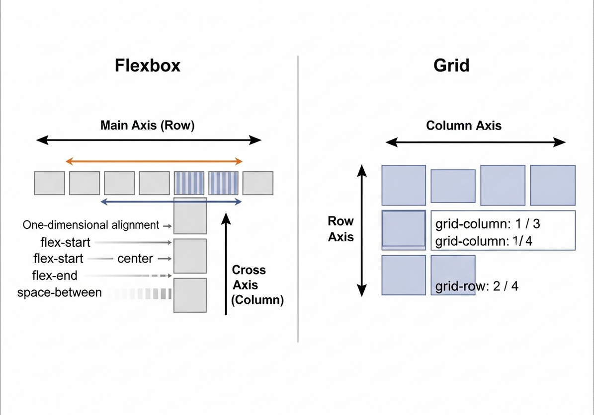
Diagram: Flexbox vs. Grid Comparison
To visually summarize the differences between Flexbox and Grid, consider the following diagram:
This diagram clearly illustrates the fundamental distinction: Flexbox operates along a single axis (either row or column), making it ideal for distributing and aligning items in one direction. CSS Grid, on the other hand, works in two dimensions, allowing for precise control over both rows and columns, making it perfect for defining complex page structures. The visual representation helps to solidify the understanding of when to apply each layout model.
Conclusion: Mastering Modern CSS Layouts
The evolution of CSS layout techniques, particularly with the widespread adoption of Flexbox and Grid, has fundamentally transformed how web developers approach design and responsiveness. Gone are the days of wrestling with floats and positioning hacks; in their place are powerful, intuitive, and semantic tools that enable the creation of sophisticated and adaptable user interfaces with unprecedented ease.
Flexbox, as a one-dimensional layout system, excels at content distribution and alignment within a single row or column. It is the go-to tool for component-level layouts, ensuring that elements within a container behave flexibly and responsively. Its properties provide fine-grained control over how items grow, shrink, and align, making it indispensable for navigation bars, card components, and form elements.
CSS Grid, conversely, shines as a two-dimensional layout system, offering unparalleled control over the overall page structure. It allows developers to define complex grids of rows and columns, placing items precisely into specific cells or named areas. This makes Grid the ideal choice for macro-layouts, such as defining the main regions of a website (header, sidebar, main content, footer) or creating intricate gallery and dashboard designs.
The true mastery of modern CSS layouts lies not in choosing one over the other, but in understanding their complementary strengths and effectively combining them. Using Grid for the overarching page architecture and Flexbox for arranging content within individual grid cells is a common and highly effective pattern. This synergistic approach leverages the best of both worlds, resulting in highly robust, maintainable, and responsive web designs that adapt seamlessly across a multitude of devices and screen sizes.
As web development continues to push the boundaries of user experience, a solid grasp of Flexbox and Grid is no longer optional but essential. By embracing these modern CSS layout techniques, developers can build more efficient, scalable, and visually stunning web applications, ultimately delivering a superior experience to users across the web.
Discussion
Loading comments...